Designing a functional website doesn’t happen overnight. It takes time and energy (and sometimes, a lot of money) to get your site in working order.
Like any other technology, the internet changes at a rapid rate. Users are utilizing various devices to view websites. For your users to maneuver through your website, you need to constantly update and adapt.
Plus, Google algorithms are constantly changing – your website’s usability affects your Google search rankings.
In short, you may not know that your website needs an overhaul. It’s tricky to keep up with the constant changes that take place behind the scenes. Thankfully, there are signs that your website needs a facelift.
Here are some of the signs that your website needs redesigning.
High bounce rate
The analytics of your website show more than how users navigate through your website. They also show whether or not you should be optimizing your website’s design.
One of the biggest analytics you should be looking at is your bounce rate. Below is a screenshot of where you can find this on Google Analytics under the Traffic Section found in “Acquisition”:
Your bounce rate is the rate at which users are leaving your website. What would cause a user to leave a website? Some factors include:
Slow loading pages
Google promotes high-quality content and pages for their users. Their algorithms rank pages with faster loading times higher than those who have slower loading times. A faster website is not only good SEO practice, it also affects how your users navigate on your page. If a user encounters a slower website, they won’t stick around.
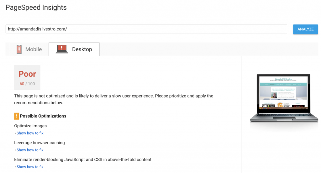
You can check the speed of your website with the PageSpeed Insights tool, shown below. This doesn’t necessarily mean your site needs a total redesign (a few things just may need to be improved), but it can be a contributing factor.
For more tips for getting a handle on your site speed, check out Ann Smarty’s comprehensive piece, ‘All you need to master your site speed without getting overwhelmed‘.
Technical errors
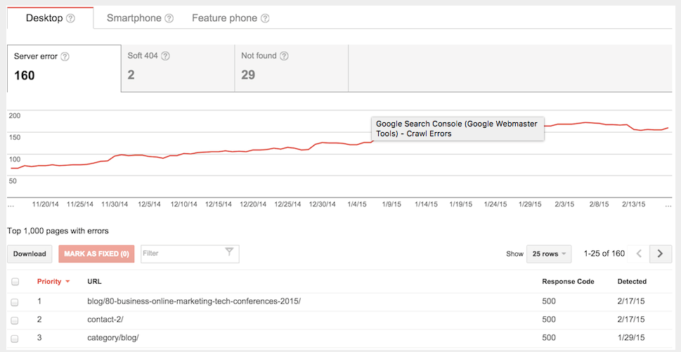
Notice that your bounce rate is all of a sudden super high? Take a look at how long users are on your page. If they’re only sticking around for a few seconds, you may have a 404 issue.
Take a look at your site from your visitors’ point of view (use different browsers, as this can also be the issue). You can also use Google’s Search Console to check the Crawl Errors.
Poor user experience (UX)
Have you ever been to a website with so many popups you couldn’t find the actual content? Google punishes those types of websites, and the average user won’t stick around if they can’t find the content they’re looking for.
This also contributes to difficult navigation, causing the user’s experience to drop significantly. Make sure that your website’s map is coherent and flows comfortably for the average user.
Mobile friendly websites
You’ve heard that more and more users are utilizing their mobile devices to access the Internet. In fact, nearly 60% of searches are carried out on mobile devices. Make sure that your website’s buttons are easy enough to access via a mobile device. Ensure that your landing pages are accessible via a mobile phone.
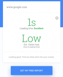
Google has an excellent free tool that allows you to test how well your website responds on devices like smartphones and tablets. Simply enter in your website’s landing page, and let the tool tell you how well it performs on mobile devices. The tool searches on a standard operating level (3G). For example, we did a sample search for Google’s website just to give you an idea of how it works.
The tool shows how many seconds (or heaven forbid minutes) it takes to load your website on a mobile device. It also shows you the estimated percentage of visitor loss you experience due to your loading time. You also have the option to pull up a free report that shows how you can fix any issues that affect mobile loading time.
For a more in-depth exploration of how to test for issues with your mobile site speed, don’t miss Andy Favell’s column, ‘How to optimize your mobile site speed: Testing for issues‘.
Outdated web design
Have you ever heard that by the time you purchase a brand new computer, it’s already outdated? The Internet works the exact same way. By the time you update your website, it’s already depreciating.
Remember the websites of the 90s? Blinking buttons, grayscale and neon colors, and lots of graphics? While many of those websites are still functioning, they’re not enticing the modern user to visit them. For example, take a look at www.ifindit.com.
First impressions mean everything, and this goes for websites as well. You not only lose credibility with poor web design, you lose visitors. Haven’t updated your website in a while? Here’s a quick primer on one of the most current trends in web design:
Modular design
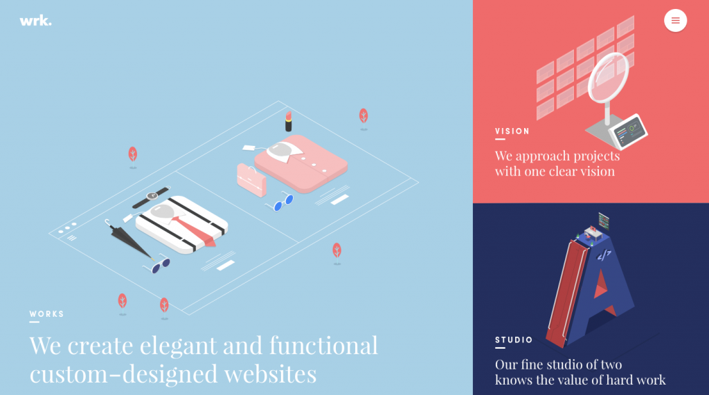
Stemming from the simplicity of newer websites, modular design is becoming more popular. The basic principle behind modular design is to use a single, flexible template that can be adapted to different kinds of content, rather than a custom-made template tailored to each specific content type. It’s the design equivalent of the intelligent content trend in content marketing.
While modular design isn’t always appropriate for 100% of cases, in many of them it is more efficient, less resource-intensive and is an easy design for users to navigate.
Here’s an example of a modular website design by Waaark design studio:
The takeaway
Think of your website as a brick and mortar business. If the shingles are falling off and your windows are boarded up, no one’s going to stop in. Sometimes it takes a little revamping to get things going again. When you’ve spent time and money designing your website, parting with the old and accepting the new is difficult.
Chances are, you aren’t aware that your website needs fixing. If your website needs an upgrade, the signs are right in front of you. Take a look at your website’s analytics – are there issues that can be improved? Adapt to the changing times and get your website mobile friendly.
Most of all, don’t be afraid to think outside the box and try something new with your web design. Overhauling your website may sound daunting, but taking the plunge will be worth the risk.
Amanda DiSilvestro is a writer for NoRiskSEO, a full service SEO agency, and a contributor to SEW. You can connect with Amanda on Twitter and LinkedIn, or check out her services at amandadisilvestro.com.
source https://searchenginewatch.com/2017/07/26/how-to-tell-if-your-website-is-due-a-redesign/


No comments:
Post a Comment