The ecommerce market is highly competitive, with thousands of small players striving to keep up with the giants like Amazon and eBay.
Still, for both leaders and followers, the web store UX stays the factor that defines who wins customers’ hearts (and purses) and who is to leave the stage.
UX stays a top priority in ecommerce as the majority of shoppers prefer convenience to a nifty look. According to Shopify, 80 percent of users admit that a poor search experience can make them leave a web store. So, a thought-out catalog navigation system is one of the crucial factors of a web store’s success.
Why faceted navigation?
Faceted search is probably the most convenient search system to date. It relies on sets of terms structured by relation (aka facets). Users mix and match options (price, color, fabric, brand, and more) to progressively narrow down the search results list until they get a short selection of relevant picks.
Apart from being convenient, the faceted search system can tell shoppers more about the products they are looking for. For example, amateur hikers looking for their first waterproof jackets will be surprised to see a variety of membrane types.
How to use faceted navigation correctly?
Like any tool, faceted navigation should be used carefully if you want to get the most of it and cause no harm to your business. So how to adjust it right? Which and how many facets to use? How to arrange them?
These six principles will help you find the answers.
1. Be relevant
For sure, facets should include only the options that shoppers bear in mind when they open a particular category. For example, the shampoo section may include hair type, hair concern, and brand. The only way to make the list of facets complete is to listen carefully to your customers.
Your search logs contain commonly search keywords, and even the messages that customers leave to the sales and support teams can give you more information about the search criteria of your target shoppers. To start, you can check the thematic filters that competitors and industry leaders use.
2. Be brief
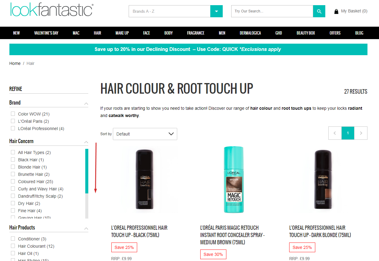
Too few facets are not enough to narrow down the search results’ list but too many options can confuse customers. How to provide an optimal number of filters? Some web stores create groups of facets that can be collapsed/expanded and add a scrollbar within each group. Consider the example of Lookfanstastic.
3. Be convenient
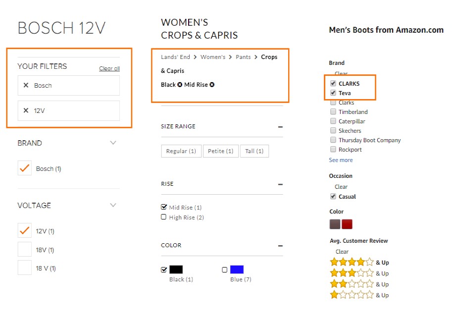
Introduce a block with the selected filters and breadcrumbs. Use bold formatting to remind customers that their search results are limited by the chosen options. And don’t forget about the “Clear all” button to let shoppers quickly start the search from the beginning. One more tip to prevent generating the “No results found” pages (which is harmful to both CX and SEO) is to use AJAX to dynamically update the number of matches next to each facet.
4. Be adaptable
Use diverse types of facets: Links, sliders, checkboxes, drop-down lists, and pop-ups.
- Using links is the most popular option to feature categories and qualitative product attributes.
- Adjustable sliders allow customers to limit a preferred range (For example, a range of prices, stars, or item dimensions.)
- If you want to allow matching based on a combination of options (say, the item should be blue and S-sized), use checkboxes. Remember to allow selection of checkboxes by clicking on their labels (the text next to a checkbox) as it’s usually more convenient for the user.
- If product attributes are few and mutually exclusive, like the types of hotel rooms, the best choices are drop-downs and radio-buttons.
- Finally, if you see that the list of must-have facets is getting too long, divide them into groups and use pop-ups to save space on the catalog page.
5. Combine search options wisely
There are three key types of facets combinations: Conditional (and), cumulative (or), and mutually exclusive. So, there are three rules for mixing facets that can help you show the faceted search results conveniently for shoppers.
- Block empty pages if you use “and” matching. “And” matching makes the web store deliver only the products that satisfy all the selected options (say, blue color and size S). As a result, many combinations will lead to “No match” (say, you have only red items in the S size) and should be blocked for both CX and SEO reasons.
- Group options if you use “or” matching. “Or” matching implies that shoppers never get an empty results page whichever combination of options they select. A study by Matthew Henry shows that splitting facets into two or more smaller groups can have a good effect on the number of pages and hence web store optimization.
- Use radio buttons for mutually exclusive options to cut the number of the results pages. For example, Amazon uses radio buttons for rating, stock availability, and price range.
6. Find your mix
There’s no golden rule in the faceted navigation design. The most commonly used filters include checkboxes and links for major attributes brand, size, type, a price slider, customer rating, and availability. As a good example, you can consider how New Look combines pop-ups, checkboxes, adjustable prices, and radio buttons.
The six tips above regard only customer convenience. Another major concern is SEO. Let’s see what you can do to make sure that faceted navigation doesn’t harm your search ranking.
How to apply faceted navigation without damaging SEO?
Though faceted navigation considerably improves the shopping experience, its implementation is a headache for SEO specialists. Faceted navigation can:
- Generate multiple duplicate or near-duplicate pages.
- Let search engines index many similar pages making the web store look full of useless content.
- Eat up crawl budget, the number of URLs a crawler can and wants to crawl.
These problems derive from the way faceted navigation works. When a shopper selects a particular combination of options, the web store delivers the results page. So the numbers of products, options, and possible combinations altogether influence the total quantity of the results pages a shopper can see. All the potential results pages contain pretty much the same information and look almost identical for a crawler. That is why a sincere attempt to deliver relevant information to a customer can make the website look suspicious to search engines.
However, there are two countermeasures that can help you tackle the problem.
1. Use canonical tags (rel=”canonical”) to show search engines which page is the key one and which are its duplicates not deserving authority or link equity.
2. Apply “noindex” and “nofollow” tags to let search engines discover the page and follow the crawling instructions regarding the page per se and the links on it. There are two ways to get the job done.
a. You can use a special meta tag in the <head> section of the page:
<meta name=”robots” content=”noindex, nofollow”/>
This directive applies to all crawlers.
b. You can instruct crawlers to skip a particular URL using the X-Robots-Tag HTTP header.
X-Robots-Tag: noindex, nofollow
Both options above work only if the page is not blocked in robots.txt. By applying any of them, you reduce the number of indexable pages. Simply put, users don’t see these pages in Google search results and you reduce the amount of duplicate content.
Afterword
Though faceted navigation is a must-have for every competitive web store, it requires time and effort to bring both convenience for customers and good positions in SERP ranking. As always, the amount of investment depends on the scale of the web store. While smaller players can go with out-of-the-box extensions, medium and large companies more often turn to custom ecommerce development services to get an ideal solution in their particular case.
Maria Marinina is a Digital Marketing Manager at Iflexion.
The post Faceted navigation in ecommerce: How it helps customers and SEO appeared first on Search Engine Watch.
source https://searchenginewatch.com/2019/03/13/faceted-navigation-in-ecommerce-how-helps-customers-and-seo/


No comments:
Post a Comment