When Google’s Search Quality Senior Strategist Andrey Lipattsev was asked about Google’s most important ranking factors, he gave three: content, links, and RankBrain.
We’ve known for a long time that links impact websites’ search rankings and Google has for a very long time emphasized the importance of quality content. What is RankBrain all about, however? Unlike content and links, RankBrain is influenced by behavior metrics that indicate that users actually find a site to be useful. These behavior metrics, more than anything else, are influenced by the usability of your website — in other words, user experience (UX).
If you’ve been focusing on content and links at the expense of user experience, you won’t be able to maximize the performance of your website in the search engines. The following five UX tips will give you an SEO advantage.
1. Work on your site’s mobile compatibility
Google hasn’t hidden the fact that it pays a lot of attention to a site’s mobile compatibility. Anyone who has been in SEO for more than a few years will remember mobilegeddon, and mobile-first indexing is a thing: in other words, coming to terms with the realization that most of the usage of its search engine comes from mobile devices, Google has decided to start indexing the mobile version of a website first.
In other words, if your website does not have a mobile version — or if the mobile version of your website is not properly optimized — then you could lose more than half of your search traffic.
Below are some tips to ensure your website is mobile compatible:
- Use a responsive website design that adapts to mobile devices or create a mobile version of your website that is properly redirected for mobile users.
- Ensure that content is consistent across your mobile site and desktop site.
- Make sure that all the content formats used on your mobile site can be crawled and indexed.
- Ensure that metadata is consistent across the mobile and desktop version of your site.
- Ensure that your sitemap is also accessible on your mobile site.
2. Optimize your website speed
Just how important is the speed of your website? Research shows that a single second delay in site load time can reduce your conversions by 7 percent, and that 40 percent of people will abandon a website that takes more than three seconds to load. In other words, people don’t like slow websites. And that explains why Google keeps strengthening page speed as a ranking factor.
While Google has long been using site speed as a factor to rank desktop sites, it recently began to use site speed as a ranking factor for mobile sites in July 2018.
You can make your website faster by doing the following:
- Enable caching
- Use a CDN
- Remove unnecessary scripts and plugins
- Compress your images
- Combine your background images into CSS sprites
- Minify your JavaScript and CSS
3. Optimize your site architecture
Another UX tip that will give your site an edge in the search engines is to optimize your site architecture in a way that is easy to use and search engine friendly. For example, take a look at the following screenshot from the website of Lookers:
In particular, pay attention to the navigation bar and you will notice a few things:
- The navigation links are clear and descriptive enough to make people know what they will get without much thought.
- People are presented with links to all the key pages — so they don’t have to waste time looking for what they want. One of the hallmarks of good site architecture is that it enables people to get to where they want with fewer clicks.
- The format and presentation of the navigation links is consistent — both the link structure and the description.
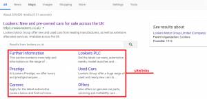
Not only will a good site structure make your site more accessible to readers, while at the same time making it easy for the search engines to crawl your website, but you are also likely to be rewarded by sitelinks. Here’s what a Google search for Lookers turned up:
4. Use breadcrumbs navigation
A breadcrumb is a secondary navigation system that helps users know where they are on your website and that can help them trace their way back. Besides the fact that breadcrumbs make it easy for users to navigate your website, they also make it easy for Google to see how your site is structured and while increasing your site’s indexability.
Here’s a look at SEW’s breadcrumbs:
As you can see, from the screenshot above, the trail goes like this “Home >> Industry >> The end of Google+ after a data breach and how it affects us.” In other words, it makes it easy for the user to trace his/her steps back to the primary category of the article, then to the homepage.
5. Work on your content readability
While we tend to focus on the technical aspects of UX when it comes to SEO, content also plays a great role in UX as far as the big G and other search engines are concerned. Making the following tweaks to your content will give you an edge:
- Ensure your content is properly formatted. Use a lot of subheadings, bullets, and numberings to make your content more easy on the eyes.
- Use short paragraphs and avoid long blocks of text.
- Work on your content grammar, spelling, and structure.
- Spice up your content with visuals and multimedia.
Conclusion
While good UX can give you an edge when it comes to SEO, it does more than that: it ensures that users actually use your website while guaranteeing an improvement in ROI and conversions.
source https://searchenginewatch.com/2018/10/30/5-ux-tips-seo


No comments:
Post a Comment